
Manage Workflows View
You can create and manage workflows through the Manage Workflows view.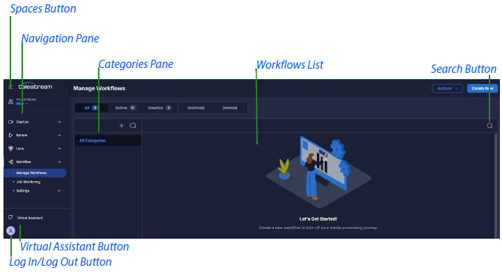
Spaces Button
Expands the drop-down menu of available spaces.Actions Button
Expands the Actions drop-down men, displaying the Import Workflows option.Import Workflows Option
Expands the Import Workflows pane.Create New Button
Expands the Create New Workflow pane.Search Button
Opens the Search field.Navigation Pane
Displays a menu of buttons for opening available UP applications.Log In/Log Out Button
Opens the Log In/Log Out dialog.Categories Pane
Displays categories of workflows. You can create categories for groups of related workflows, and name the categories accordingly.Workflows List
Displays a table of workflows available for the selected Space and category.When you hover your cursor over a row in the workflows list, a three-dot button appears at the right side of the row. Clicking the three-dot button expands a menu of available actions.
Name
A sortable column that displays the names of the workflows. A green dot to the left of a workflow name indicates the workflow is active. When you hover your cursor over a pencil icon in the Name field, a pop-up displays the name of the person currently editing the workflow.Jobs
Displays job-status badges showing the number of jobs in each job status for each workflow. The status badges indicate each of the four statuses, from left to right:- Waiting
- In progress
- Completed
- Failed
Total Jobs
Displays the total number of jobs using each workflow. This is the total of all the jobs in all four job statuses.Description
Displays the description of each workflow. You can write your own descriptions.Tags
Displays the tags for each workflow. You can write your own tags, and use them for finding workflows with the same tags.Last Modified
A sortable column that displays the date and time the workflows were last modified.Last Modified By
Displays the names of the last people to edit the workflows.Created
A sortable column that displays the date and time the workflows were created.All Filter Tab
Displays all the active and inactive workflows in the selected space and category. A green dot to the left of a workflow name indicates the workflow is active.Active Filter Tab
Displays active workflows in the selected space and category. A green dot to the left of a workflow name indicates the workflow is active.Inactive Filter Tab
Displays inactive workflows in the selected space and category.Archived Filter Tab
Displays archived workflows in the selected space and category.Deleted Filter Tab
Displays deleted workflows in the selected space and category.Workflow Designer View
You can create new workflows in the Workflow Designer view.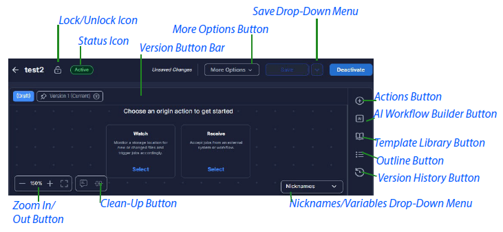
Lock/Unlock Icon
Displays whether the workflow is locked or unlocked.Status Icon
Displays whether the workflow is in Active or Inactive status.Version Button Bar
Displays buttons for versions open on the Workflow Designer.More Options Button
Opens a drop-down menu listing the following functions:Edit Details
Opens the Edit Workflow pane.Lock/Unlock
Locks or unlocks the workflow. Changes the state of the Lock/Unlock Icon .Archive/Restore
Archives or restores the workflow.Move To
Moves the workflow.Copy To
Copies the workflow to a desired location.Delete
Deletes the workflow.Export
Exports the workflow into a file.Save Drop-Down Menu Button
Displays the following options:Save
Copies the workflow to a desired location.Save as New Version
Deletes the workflow.Discard Changes
Exports the workflow into a file.Activate/Deactivate Button
Activates the workflow so that you can submit jobs to it, or deactivates the workflow. Changes the status displayed on the Status Icon .Zoom In/Out Button
Controls the display size of the workflow canvas. To zoom out, click “-”. To zoom in, click “+”. To jump to 100%, double-click the numeral. To reframe the canvas to display all actions, click the reframe button. To move the canvas, click on the canvas and hold while moving your mouse. Alternatively, press Alt or Cmd and use your scroll wheel to zoom in or out. To select actions, press Shift, click on the canvas and hold to draw a lasso around the actions desired.As you zoom out, the data displayed on the actions is reduced. As you zoom in, the data displayed on the actions is increased.